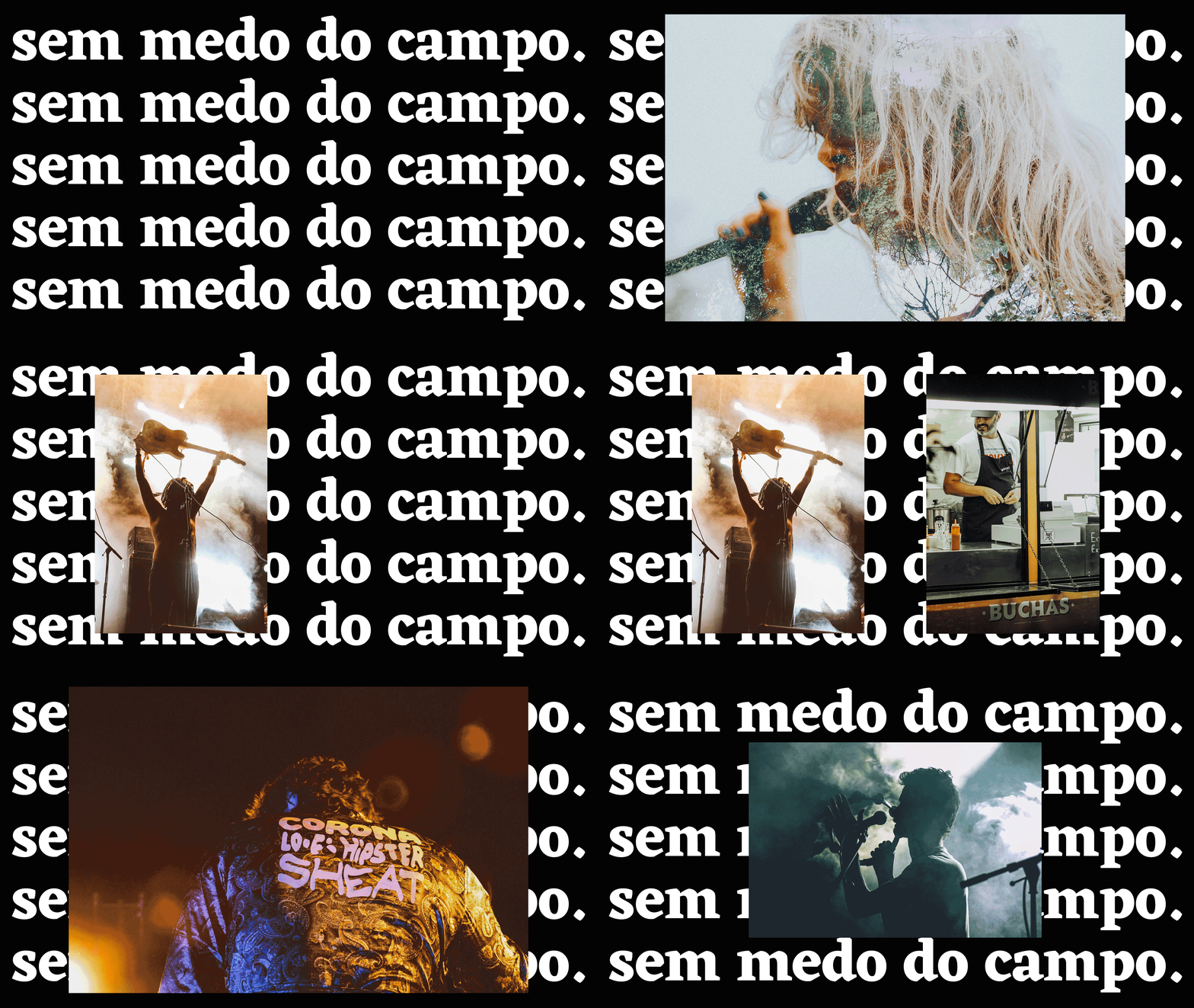
"Um festival para quem não tem medo do campo."
Rodellus is a music festival that originated from the creative efforts of a group of young individuals in Ruilhe, region of Braga. The festival was launched in the early days of 2015 with the primary aim of bringing people together through the universal language of music and celebrating the region's rich cultural heritage.
As the festival gained popularity over time, a challenge was faced - redesigning its identity and creating a graphic line for the following editions. This challenge was taken on with zeal and enthusiasm, bringing creativity and innovative ideas to the fore.
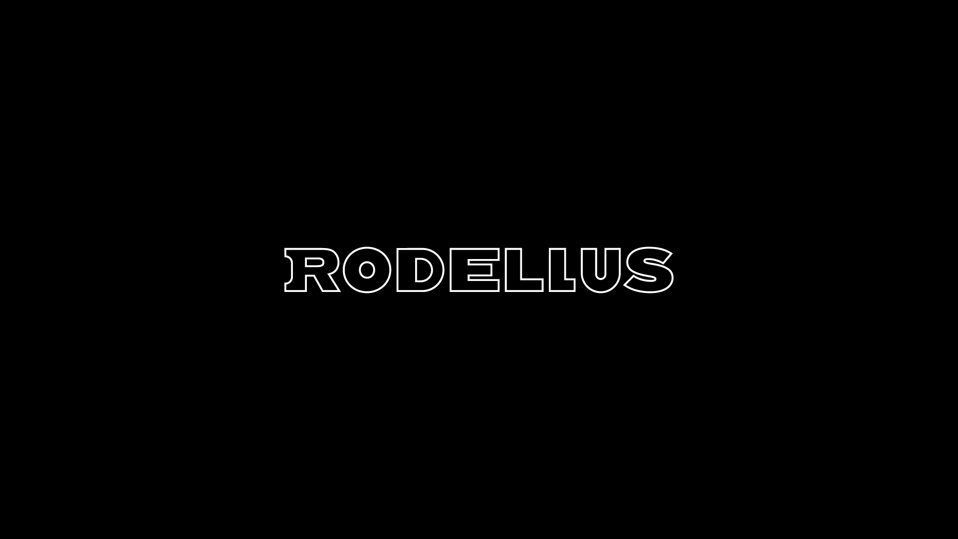
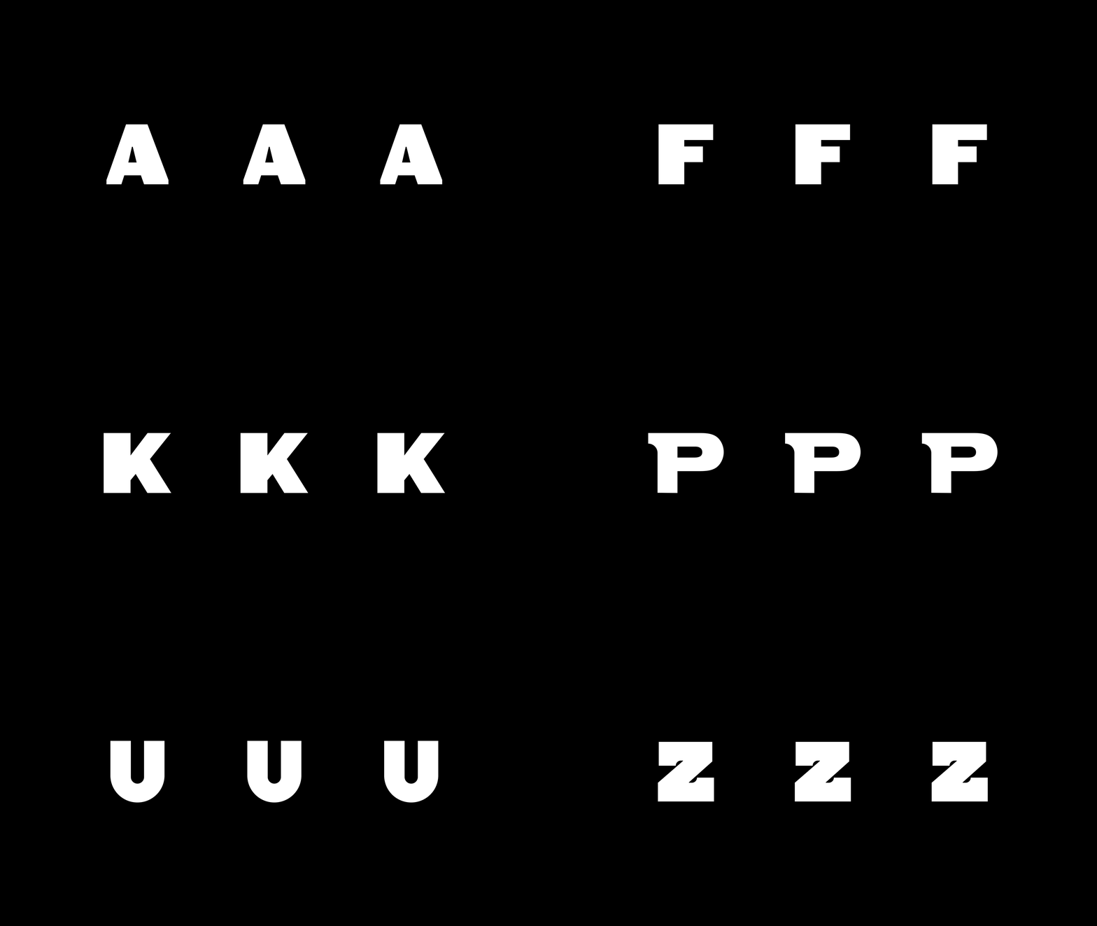
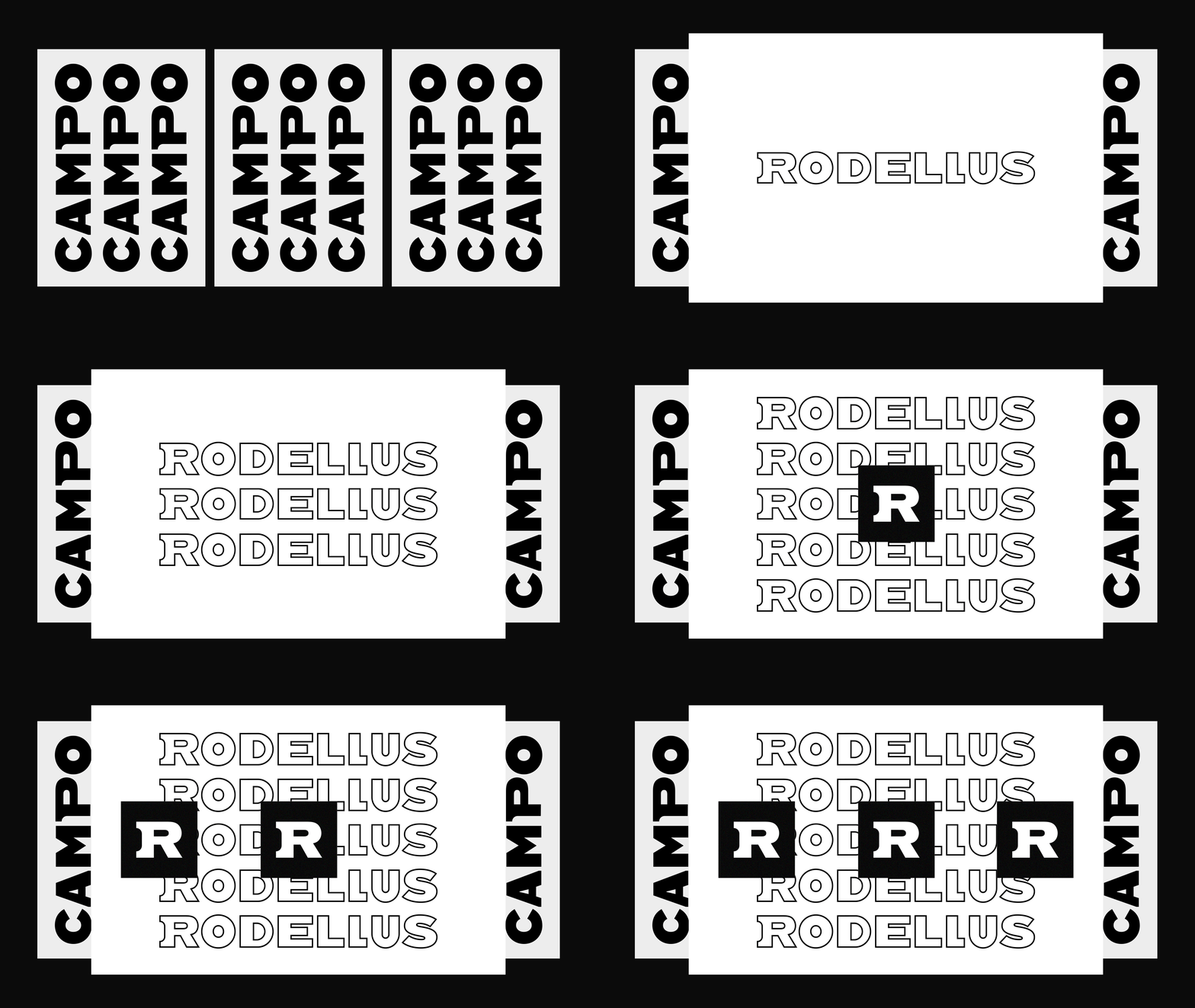
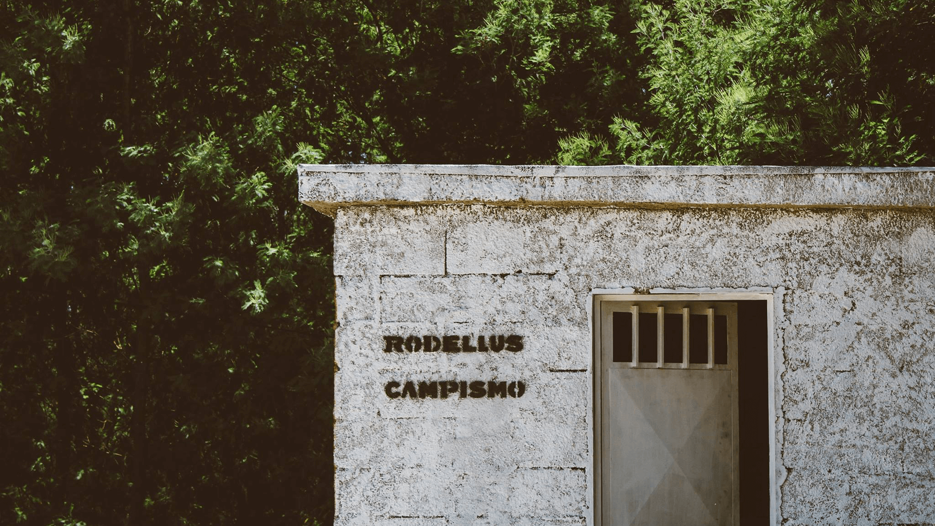
The result was something truly remarkable! A unique custom typeface formed the centerpiece of the festival's new logo. This distinctive typography was designed to work in two ways - as a fill and outline version. The symbol stood out against a stark black-and-white backdrop, making the festival easily recognizable.
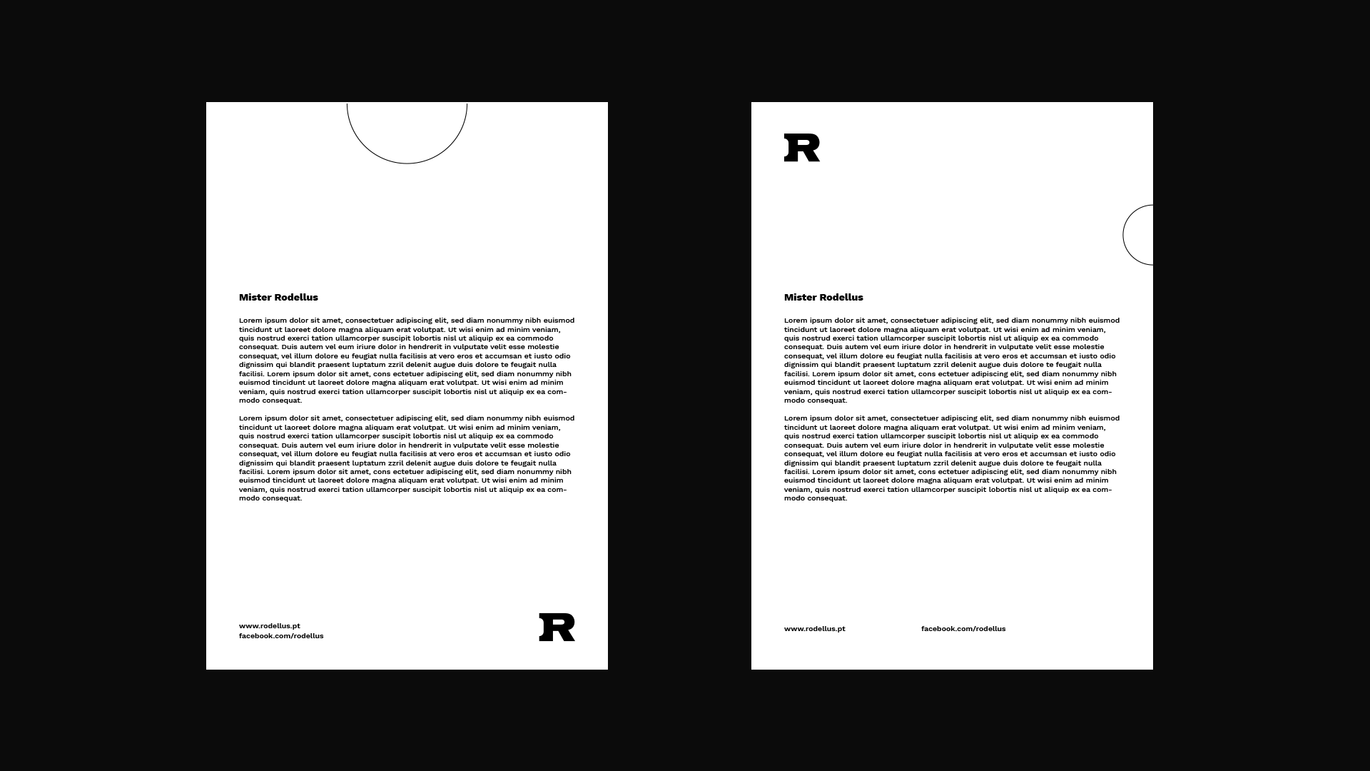
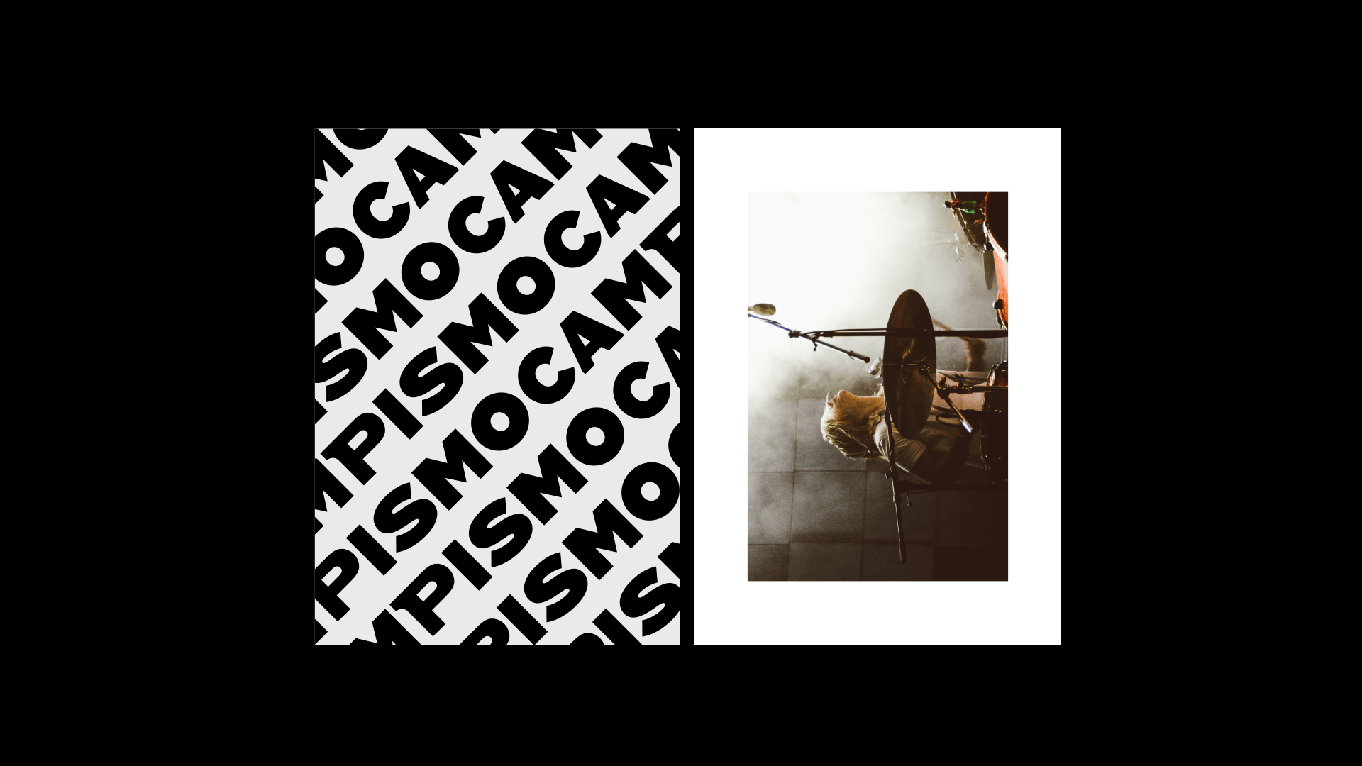
The redesign was not limited to the logo alone. An array of posters and other promotional materials was created, each with its distinct image and style. This approach ensured that each musical production had a unique identity while maintaining the overall branding of the festival.
Today, the Rodellus music festival has become a celebrated event in the region, drawing crowds from far and wide. The festival's success can be attributed to the creativity and passion of the young individuals who brought it to life and their dedication to creating a vibrant and dynamic cultural space through the power of music.




Client: Rodellus
Studio: Klax Studio
Studio: Klax Studio
Design: Ivo Amadeus Reis & Rita Rodrigues
Event Photography: Joana Sousa
Event Photography: Joana Sousa