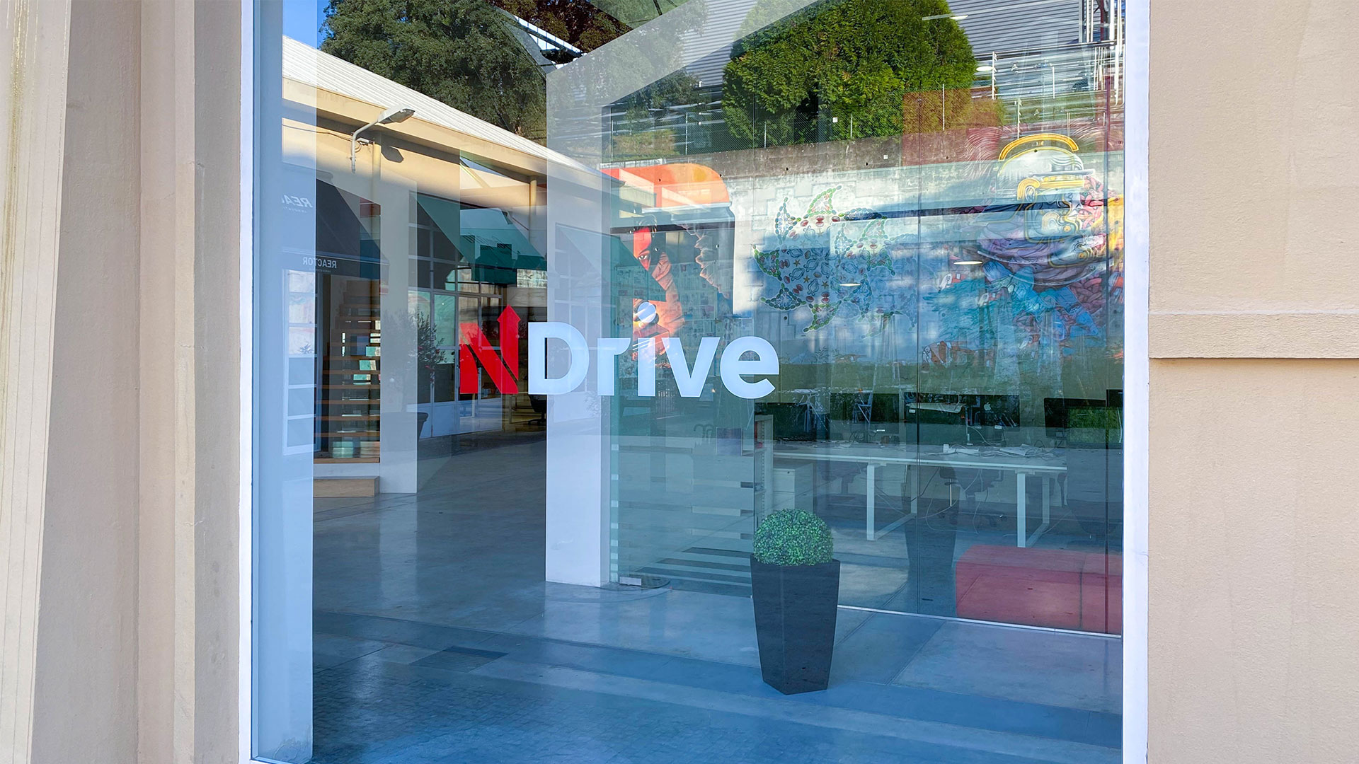
Ndrive re-brand
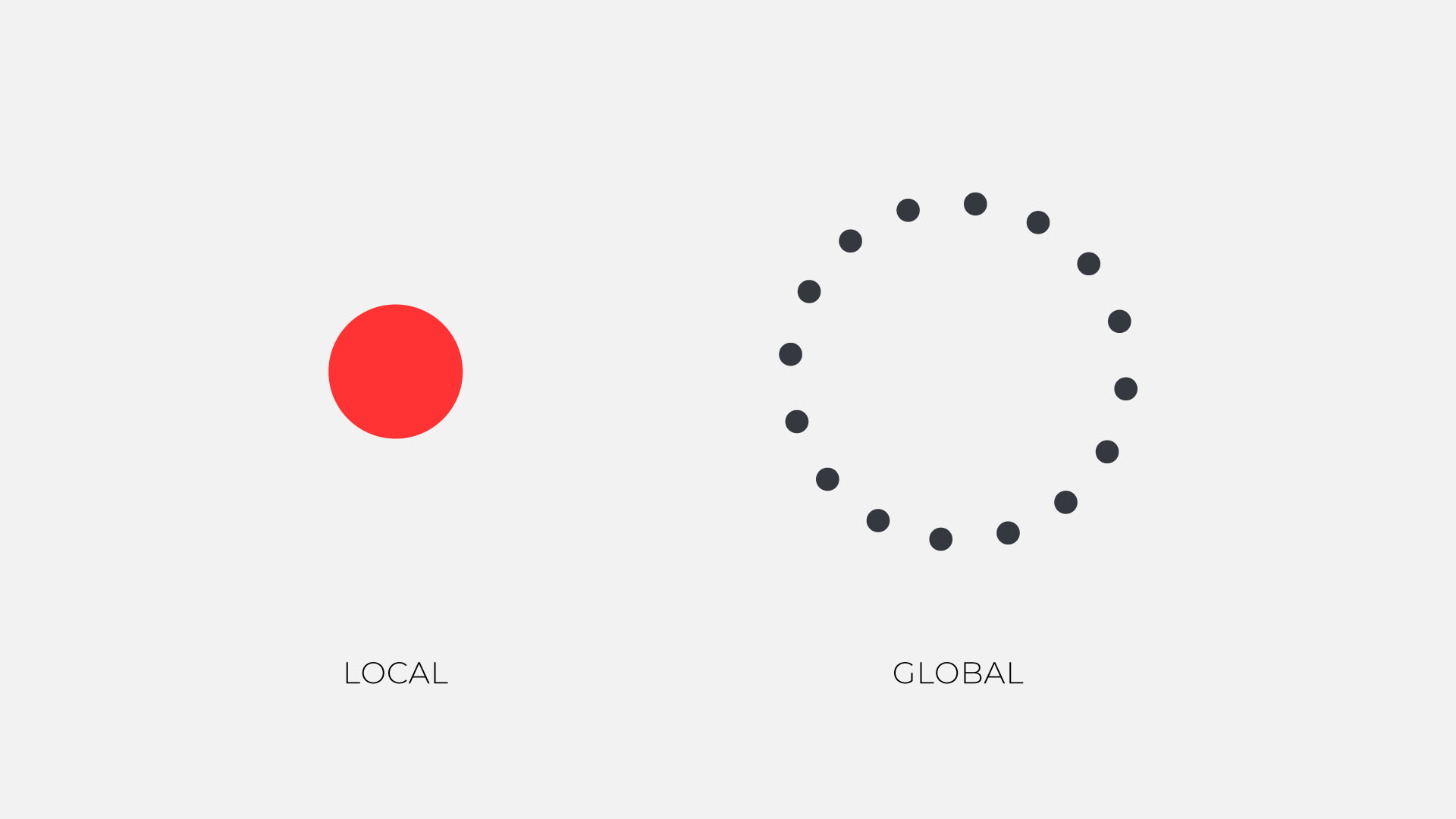
NDrive is a technology company that has developed software based on onboard map data, providing users with a network-independent experience. This software connects to the cloud, allowing for various Location Based Services, such as real-time traffic updates and social network integration.
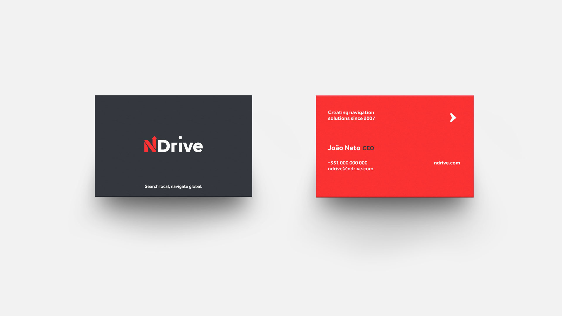
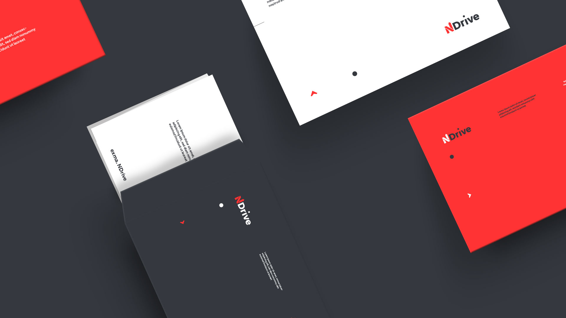
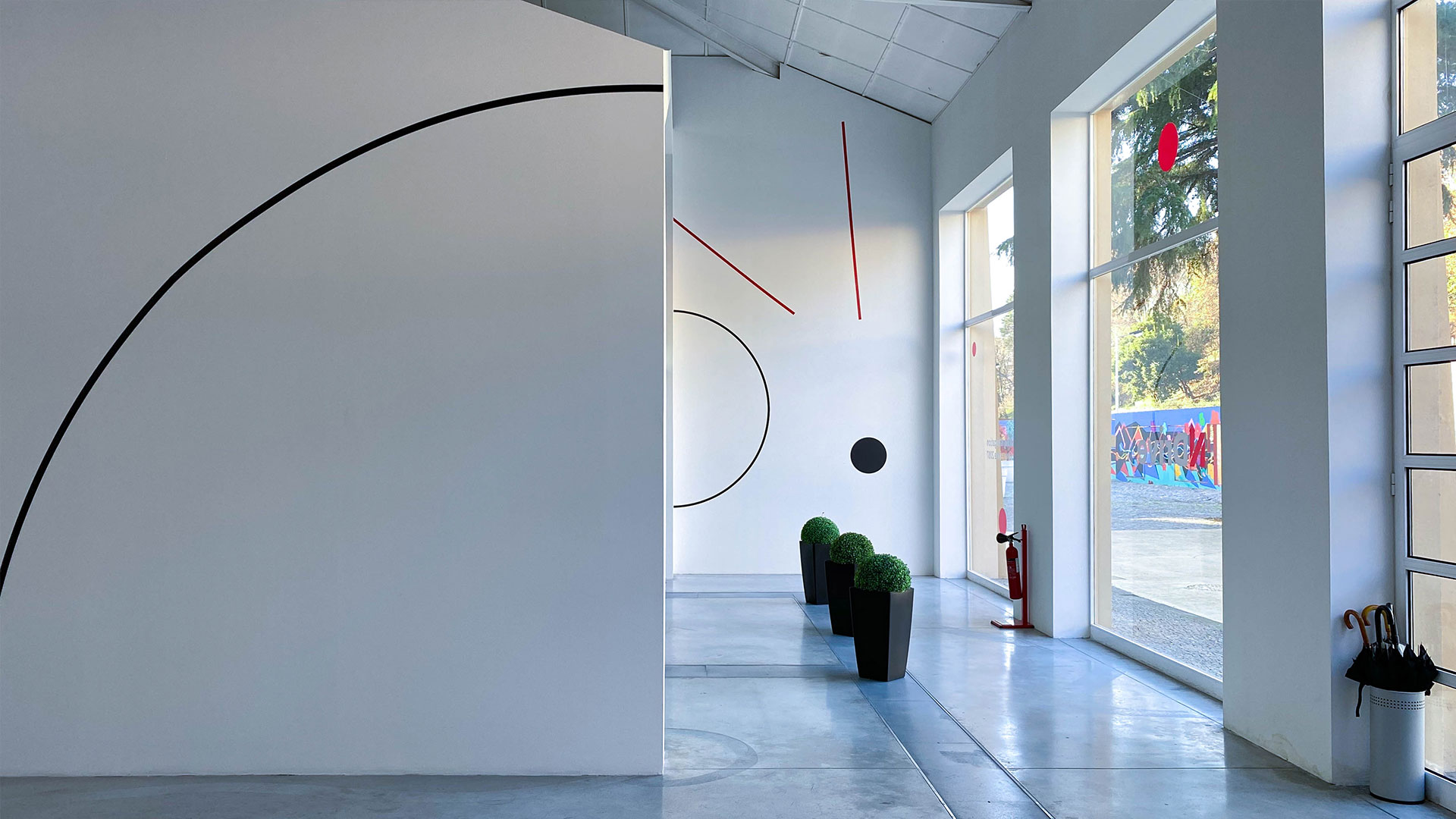
The brand redesign was approached with a fresh perspective, focusing on creating a modern and versatile identity that reflects NDrive's commitment to innovation. The goal was to evolve the previous mark, removing gradients and 3D effects to create a cleaner, more streamlined design that better represents NDrive's new world of technology.
While retaining the iconic red color the company is famous for, the expanded color palette allows for more flexibility and adaptability to different sectors and audiences. The resulting brand identity evokes a sense of playfulness without fuss, staying true to its original intention.
Overall, the redesign was driven by the desire to create a more user-focused and empowering brand, representing NDrive's dedication to providing a network-independent experience and a range of Location Based Services. The new brand identity is powered by NDrive's commitment to excellence and the needs of its customers.


Client: Ndrive
Creative Direction: Ivo Amadeu Reis
Design: Ivo Amadeu Reis
Creative Direction: Ivo Amadeu Reis
Design: Ivo Amadeu Reis
Videos: Ivo Amadeu Reis
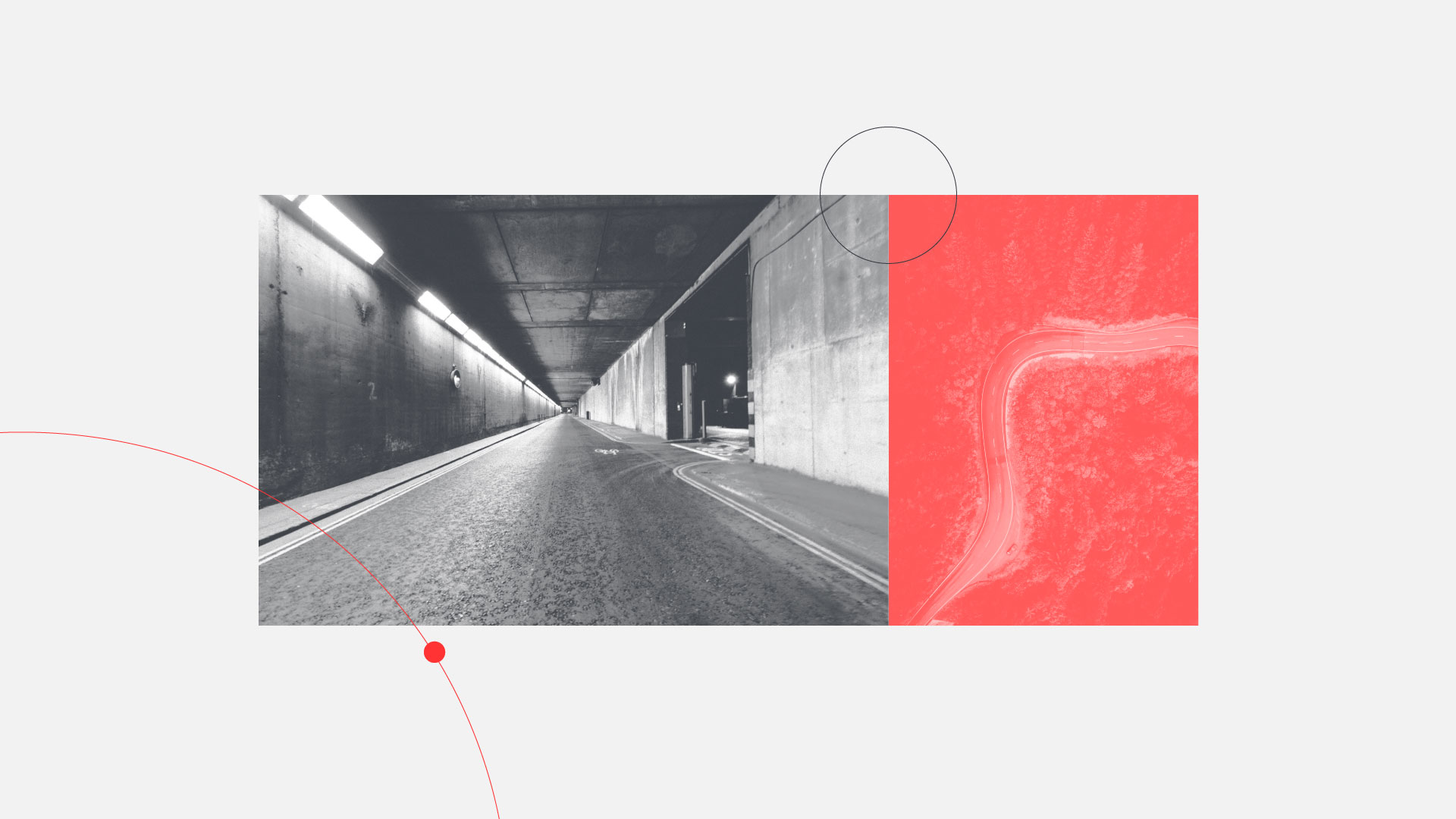
Photography: Ivo Amadeu Reis
Photography: Ivo Amadeu Reis